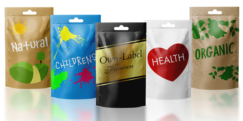
As consumers we are constantly making decisions; some important, others less so. Some we consciously make, others more intuitive. How often have you, as a consumer, come home from the supermarket and unpacked products that you didn’t even know you wanted? Why did you buy one particular brand over another? Let’s delve into the power of packaging.
Behavioural economics tells us that human behaviours are driven by two decision making systems within the brain. The right side of our brain (system 1) is fast, intuitive, emotional. This side makes quick, largely automatic decisions for us when it comes to things like fashion, coffee, music, biscuits – without significant mental effort. The left side (system 2) deals with equations, mortgages, complex problems. It’s slow, logical and pretty tiring because we are required to think hard about the decision in hand.
Consider then, that we face between 2,500 and 10,000 decisions every day and that up to 95% of these are made subconsciously. Add to this the fact that most purchasing decisions take as few as 2.5 seconds and we get a glimpse of the possibilities that lie ahead.
Because, what this means for us as marketers is that it is possible to influence decision-making at point of purchase by providing visual cues that will draw attention to a product and appeal to a desired audience.
This is no more true than in the supermarket, when consumers are faced with countless products and brands all vying for attention. In the absence of taste, packaging is key.
The case of Tropicana can be used to illustrate the importance of system 1. In 2009 Tropicana changed the packaging design of their fresh orange juice cartons in the US, replacing the familiar ‘straw in the orange’ design with something simpler and more rational (it now showed an actual glass of OJ and stated ‘freshly squeezed orange juice’ on pack). The result? Unit sales fell off a cliff and Tropicana quickly reintroduced the old packaging.
So what design elements need to be included to trigger a consumer’s subconscious and ensure your product is ‘randomly’ chosen and dropped into the trolley? Enter semiotics. This is where it gets (even more) interesting…
Semiotics is the study of signs and symbols – non-verbal codes within a cultural context that convey meaning to consumers. Consumers learn these codes and their associated implications and respond intuitively to those contained in brand communication, particularly packaging.
General category codes act as visual signposts that form immediate associations and expectations in the consumers’ subconscious. Cues include colour, language, typography, format and symbols.
So, what are some of the category norms within the food sector?
New product design must therefore respect familiar category codes or risk confusion in the minds of consumers.
Semiotics research however, can delve more deeply into these, decoding and identifying the trends within the category. This analysis can be hugely insightful for brands in providing a direction for packaging design innovation and implementation.
Packaging on the free from shelves remains rooted in health, with clean lines, straightforward messaging and key ingredients, with category colourways driven largely by the retailers predominantly green or purple own-label offering.
That said, the rapid expansion of the free from category and subtle changes in language seen on packaging by the biggest brands in recent months, make for some interesting emerging trends that seem set to attract new consumers to the category and grow the market further still.
Now, that’s the power of packaging.

